IT Office Interior Design for Focus
Ask ten different CEOs what the future of the workplace looks like, and you will get ten different answers. Some swear by remote work forever, while others are mandating a strict five-day return. But if you cut through the noise and look at what is actually happening on the ground, the truth is somewhere in the middle. The office isn't dead, but the old version of it? That is definitely gone.
For a long time, the trend of IT office interior design was simply cramming as many desks as possible into a glass box. Then the pendulum swung way too far the other way. Suddenly, every startup thought they needed a slide, a kegerator, and a nap pod. Thankfully, we are finally finding the balance.
My philosophy at Tailored Interior is pretty simple. Employees don't just want a second living room. They already have a living room at home, and honestly, the coffee is usually cheaper there. They come to the office to get things done.
The real goal of modern interior design is to create a frictionless environment. If the Wi-Fi drops, the monitor arm is wobbly, or the acoustics are terrible, no amount of velvet throw pillows will make your team happy. We have to design for focus, for collaboration, and for the specific ways tech teams actually work.
I’m going to show you what giants like Google and Netflix are doing right now, and then I’ll share the exact six-step process I use to bring those kinds of results to my own clients.
The Shift to Humanized IT Office Interior Design
There is a reason the phrase "human-centric" is in just about every design brief I see lately. For decades, we designed offices around the machines. We built rows of grey cubicles to house heavy computer towers and landline phones. But now that the technology fits in a backpack, the office needs to be designed around the actual human beings using it.
We are finally moving away from that sterile, white-walled aesthetic that defined the early 2000s tech boom. Just look at the Hyatt at the Circle office in Zurich. It doesn’t feel like a corporate HQ; it looks like a luxury high-end hotel lobby. They used curved glass walls, thick curtains for acoustic privacy, and swathes of velvety fabrics.
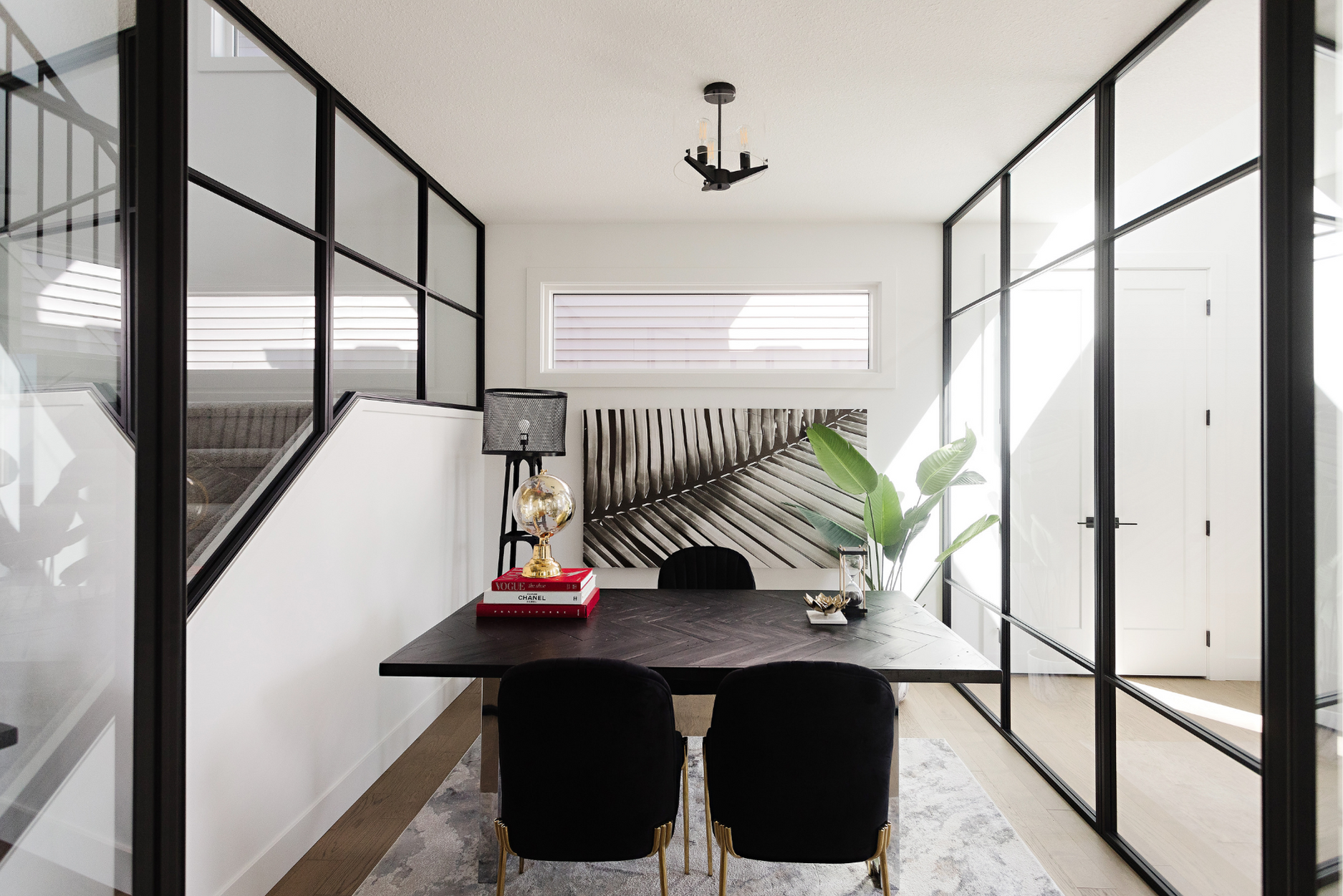
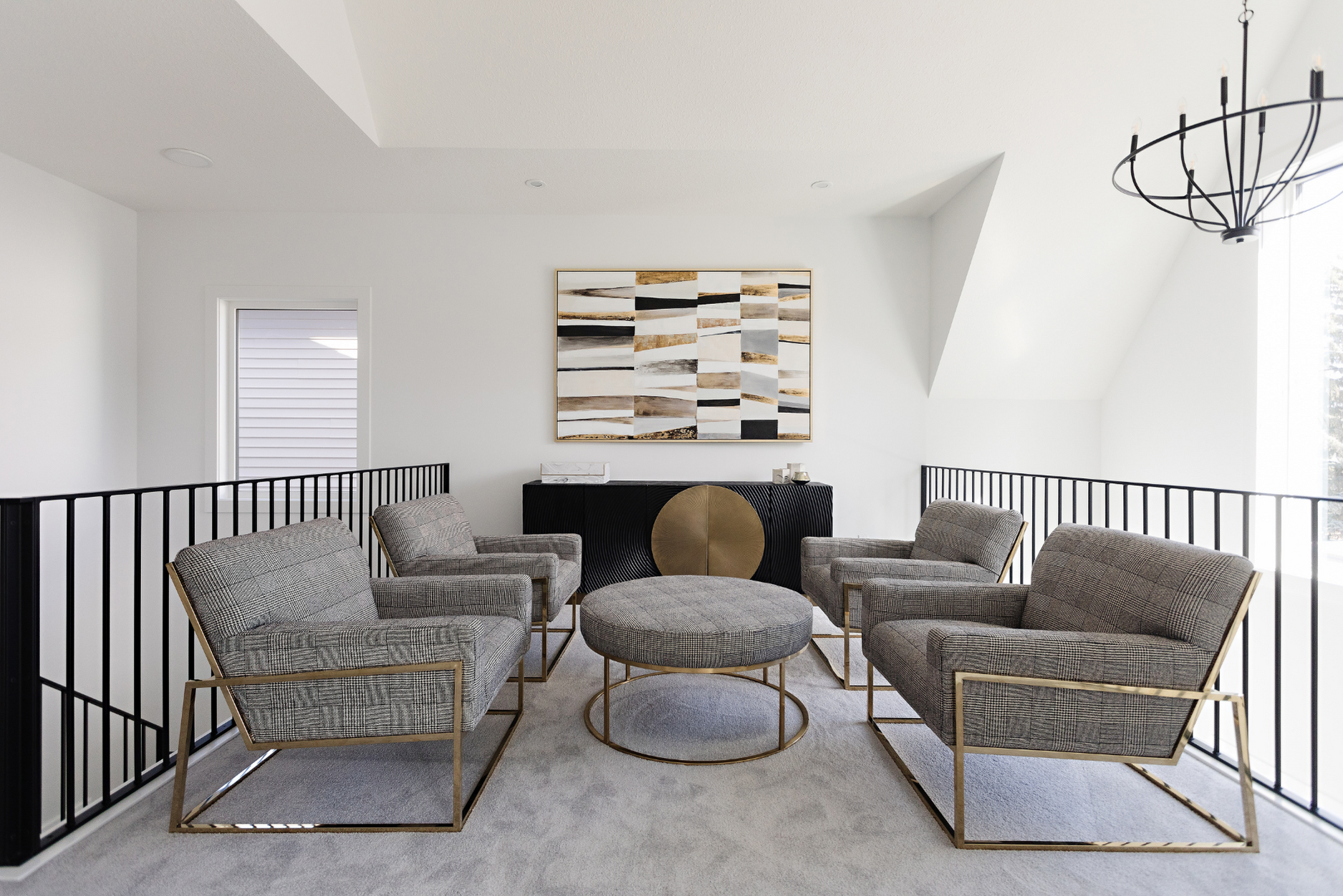
However, I always warn my clients not to go overboard. You don’t want a space that puts people to sleep; you want a space that supports their workflow. It is about giving an engineer the choice to code in a quiet library zone in the morning and then brainstorm with their team on a sofa in the afternoon.
The Biophilic Boom: How Google is Bringing the Outdoors In
If there is one trend absolutely dominating the design world right now, it is biophilia. And let me be clear that I am not talking about sticking a sad, potted fern in the corner of the breakroom and calling it a day. The industry's biggest players are completely blurring the lines between indoors and outdoors.
Take Google’s new London HQ. They are building what they call a "landscraper." It is a building as long as the Shard is tall, with a rooftop garden that stretches for 300 meters. They are planting strawberries, gooseberries, and sage up there.
Now, in my own projects here in Edmonton, we prioritize natural elements wherever we can. I worked on a project recently that we affectionately dubbed the "Bunker Project" because it was in a basement with absolutely zero natural light. Since we could not fake the sun, we leaned into the vibe with high-end task lighting and lush plants that thrive in low light. It kept that connection to nature alive even underground.
The "Living Room" Effect: Learning Comfort from Airbnb and Netflix
The competition for talent in the tech world is absolutely fierce right now. To entice people out of their sweatpants and back into the office, companies are bringing the comforts of home into the workplace. Airbnb is the perfect example of this. They basically reinvented the meeting room.
Instead of stuffy conference tables, they built replicas of their most famous listings. You can literally have a meeting in a houseboat or a cozy living room with a fireplace. It reflects their brand, but it also totally changes the vibe of a meeting. It is pretty hard to be uptight when you are sinking into a plush sofa.
Netflix takes it a step further at their headquarters. They have "chill rooms" with bean bags and huge screens. It signals to the team that it is okay to take a break and decompress.
Here is my professional take on this, though. You have to be careful. You want comfort, but you definitely do not want to encourage napping on the job. We need to find that sweet spot where a developer can sit comfortably with a laptop for an hour without destroying their posture.
The "Neighbourhood" Concept
Let’s be honest. The open-plan office has taken a beating in recent years, and rightfully so. It is loud, distracting, and terrible for privacy. Yet building private offices for everyone is expensive and tends to isolate teams. The solution we are seeing at places like Nuro and Twitter is called "Zoning" or creating "Neighbourhoods."
Nuro’s HQ in Silicon Valley is actually designed like a city map. They have a "ring road" for circulation that keeps heavy foot traffic away from the desks. Then they have distinct neighbourhoods for different teams. This breaks the massive floor plate down into digestible chunks. You are not sitting in a sea of 500 desks. You are sitting in your team’s neighbourhood of 20 desks.
Twitter did something similar by placing its meeting rooms and ancillary spaces in the center of the building. This pushes the desk areas to the perimeter where the windows are. It buffers the sound and ensures the people doing heads-down work get the natural light.
I use this neighbourhood concept in almost every layout I design here. We use furniture, plants, or acoustic dividers to create visual boundaries. It stops that feeling of being watched in a fishbowl and gives teams a real sense of ownership over their specific area.
When the Office Feels Like a 5-Star Hotel
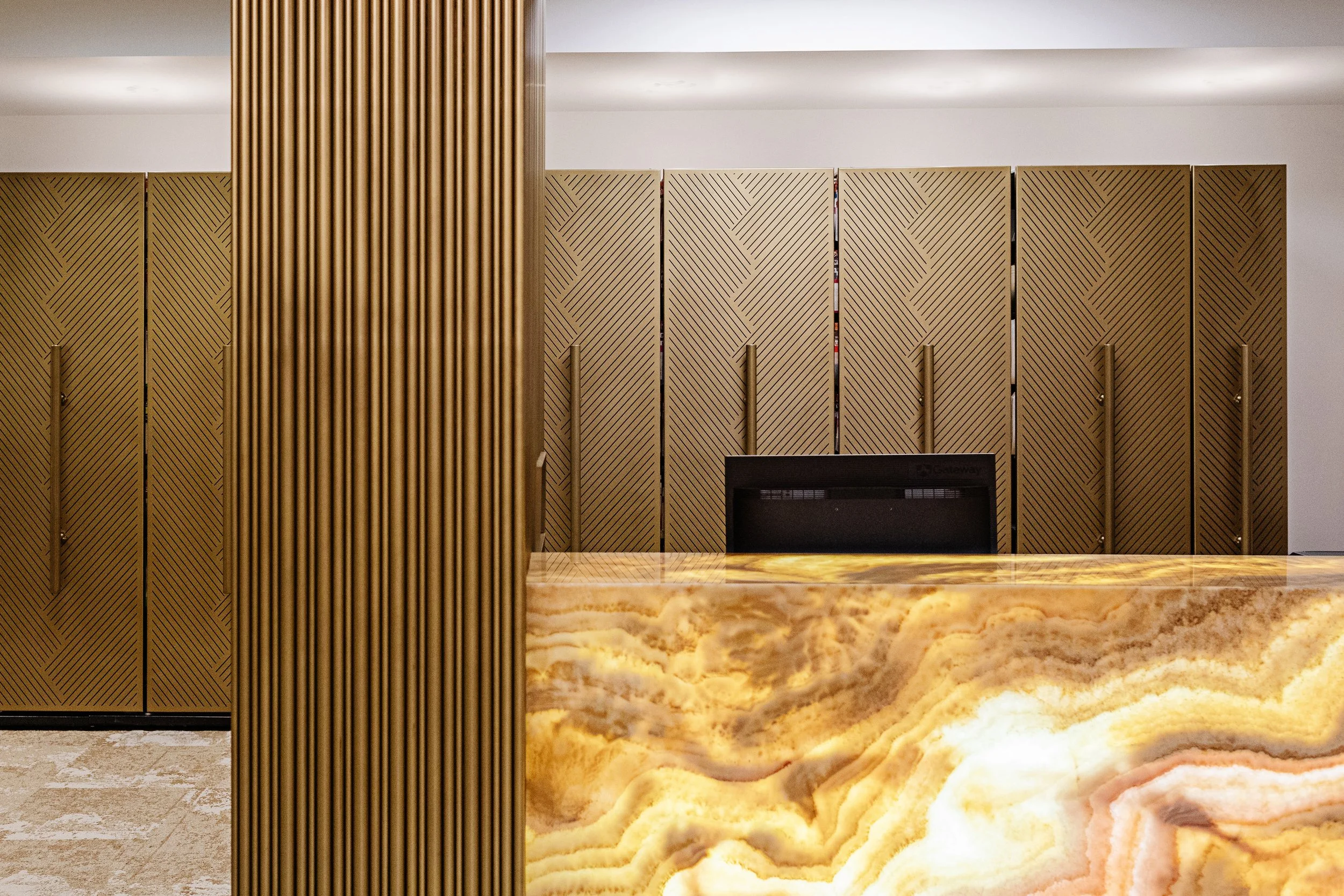
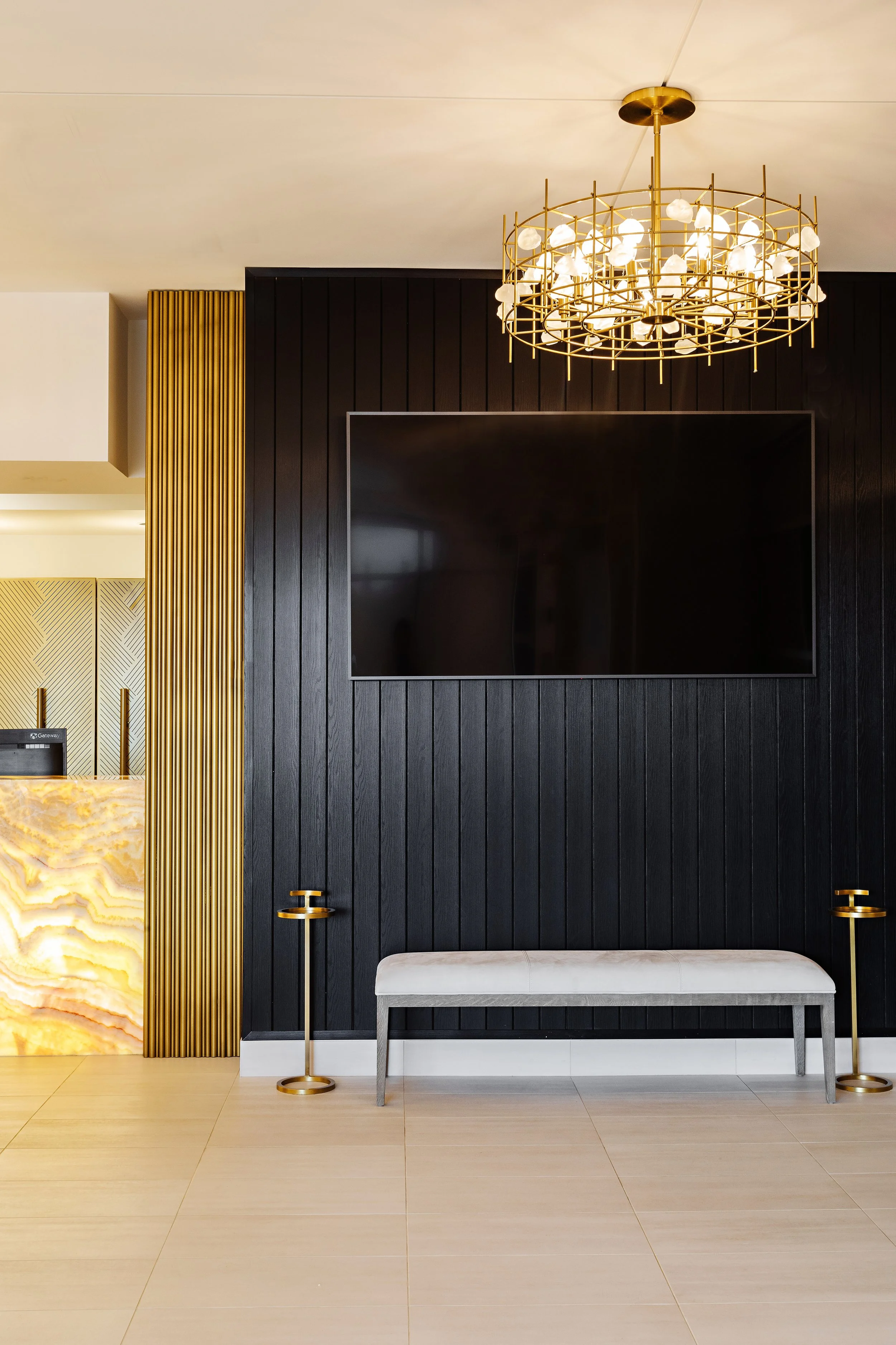
There is a massive crossover happening right now between hospitality design and workplace design. We call it the "hotelification" of the office. Companies are finally realizing that if they want their staff to brave the commute, the destination needs to be significantly better than their apartment.
The Hyatt office in Zurich is obviously leading the charge, but take a look at Retool’s HQ in San Francisco. It feels more like a boutique hotel lounge than an office. They use earthy tones, cool graphic wallpapers, and high-end fixtures.
This trend is also about service. It is about having a concierge-style reception or a coffee bar that rivals the local cafe on Whyte Ave. LinkedIn’s New York office even features a hidden speakeasy. These amenities create a "cool factor" that makes people actually want to bring guests and clients by.
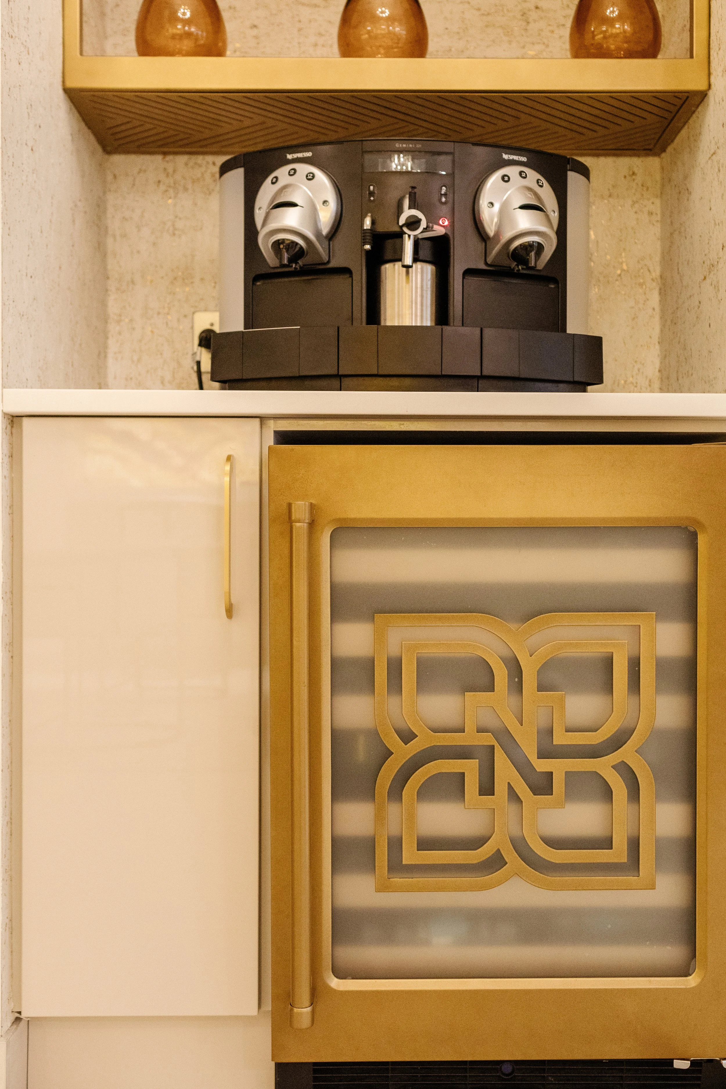
For my clients here in Edmonton, I often focus on the "entry experience." What is the first thing you see and smell when you walk in the door? If it is a flickering fluorescent light and the smell of stale coffee, you have already lost them. We upgrade the lighting, install a high-quality espresso machine, and use warm materials in the lobby to set the right tone right away.
Turning Bomb Shelters and Factories into Creative Hubs
One of the coolest trends in IT office design right now is adaptive reuse. Tech companies love a good origin story, and moving into a building with history gives you instant character that you just cannot build from scratch.
The most extreme example of this is Bahnhof in Stockholm. Their data center and office are built inside a former atomic bomb shelter. It is literally a cave with granite walls. Instead of covering it up, they highlighted the rock, added futuristic lighting, and suspended meeting rooms mid-air. It looks like a Bond villain’s lair, and it fits their brand as an ultra-secure ISP perfectly.
On a lighter note, Spring Studios turned a 19th-century paint factory into a creative workspace. They preserved the exposed steel girders and the building's industrial soul, while updating it with modern amenities.
Personally, I love these projects because the constraints force you to be creative. You have to work around weird columns and old piping. However, those quirks become the defining features of the space. It gives the office a soul.
A 6-Step Process for Your Own Office Transformation
Seeing these incredible spaces is inspiring, but how do you actually execute this for your own company here in Alberta? You cannot just buy a bunch of bean bags and call it a day. Successful design is not just about the aesthetic. It is about the process.
At Tailored Interior, I follow a strict six-step framework when I work with commercial clients. This ensures we do not just make a pretty space. We make a functional one that actually solves business problems.
Creating the Vision and Defining Culture
Before we draw a single line or pick out a single fabric swatch, we have to sit down and talk about the vision. This is the "Why." Why are you moving? Why do you need a new design right now?
Is your goal to increase collaboration between sales and engineering? Is it to impress investors? Is it to recruit top-tier talent? The design for a scrappy startup is going to look very different from the design for a strictly regulated fintech firm.
We create a clear brief during this stage to align the aesthetics with your company values. If your company value is "Transparency," we probably shouldn't build a maze of closed-door offices. If your value is "Focus," we definitely shouldn't build a giant, chaotic game room right in the middle of the work floor.
Workplace Research and Behaviour Analysis
Honestly, it is the step that causes most projects to fail. You have to understand how your people actually work.
I have a bit of a secret weapon in this phase. I interview the interns. Okay, I know that sounds a little specific, but hear me out. The CEO sees the office as they want it to work. The junior developers see how it actually works. The interns are the ones who know that the printer is always jammed or that the "quiet room" smells like the microwave next door because of bad ventilation.
We dig deep into the factors that link employee behaviours to results. We figure out the ratio of introverts to extroverts. Engineers usually need long periods of uninterrupted deep work time, while sales teams need energy and buzz. You cannot put them next to each other without a buffer. We map these behaviours out before we plan a single square foot.
Block Planning and Resource Allocation
Once we have the research, we move to Block Planning. Think of this like a high-stakes game of Tetris. We take your available square footage and start allocating space to the different departments and amenities.
We figure out the circulation paths because we want to create "collision points" where people naturally bump into each other. This is usually around the coffee machine or the main entrance. We want to encourage those accidental conversations that lead to new ideas.
We want to remove the bad friction, like having to walk across the entire office just to find a meeting room. However, we love good friction, like having to walk past the design team to get to the kitchen so you see what they are working on. We look at the block plans to ensure the flow makes sense for everyone.
Concept Design and 3D Visualization
Now we get to the creative part. We start producing initial concept sketches, mood boards, and palette selections. This is where the look and feel finally start to come together.
Once the sketches are approved, we move to 3D visualization. Let’s be real, looking at a 2D blueprint is tough. It is hard to look at lines on a page and understand how the room will actually feel. 3D renders let you see the volume of the space. You can see how the light hits the desks in the afternoon. You can see if that bright yellow wall is going to be energizing or just a massive headache.
This allows us to collaborate closely. You might see the render and realize the reception desk feels too imposing, or the breakout area looks a little too cluttered. We can fix those things virtually before we spend a single dollar on construction.
Technical Detailing and Interior Finishes
The final phases are Detail Design and Interior Finishes. This is where we produce the full drawing package for the contractors. We specify everything from the joinery of the cabinets right down to the exact location of the power outlets.
This is where the real magic happens for those "Deep Work" environments. Acoustics are a massive part of this. We select materials that actually absorb sound. In that "Bunker Project" I mentioned earlier, we used acoustic baffles on the ceiling and fabric-wrapped panels on the walls. It turned a concrete echo chamber into a space that felt as quiet as a library.
We also select the final textures and furnishings. We pick sustainable materials and furniture that last. We also look at the "touch and feel." We want materials that feel warm and natural, like wood and wool.
Investing in Employee Wellbeing
An office redesign is a big investment. But you have to look at the ROI. The highest cost for any tech company is the payroll. If you can make your team just 1% more productive or 5% happier, the design pays for itself almost immediately.
When people feel proud of their workspace, they are more likely to stick around. Listen to your people. Design for human needs. Bring in nature. And create a space that makes it easier to do great work.
If you are planning a commercial interior design project or looking to update your office space with an award-winning interior designer, Tailored Interior can guide you through this process from start to finish. We handle everything from the initial block planning to the final coat of paint, ensuring your business gets a space that works as hard as you do. Contact us today to discuss your vision or visit our Edmonton interior designer.