Darkish Grey Interior Design
Dark grey has moved far beyond trend status. When used properly, it creates depth, balance, and a refined look that works across many design styles. Knowing how to use darkish grey starts with understanding how grey behaves in light, how it interacts with other colours, and how to apply it with intention rather than overuse.
Grey is not flat or boring. From cool tones to warm grey colours, it offers flexibility that few other neutrals can match. Whether you’re updating one room or redesigning your entire home, dark grey can elevate the space when used correctly.
How to Use Darkish Grey for a Modern Home Aesthetic
A modern interior benefits from clean lines, layered textures, and controlled colour contrast. Using dark grey in this context means choosing grey paint for walls that feels rich but not heavy. Darker tones of grey work best when balanced with lighter finishes, natural light, and intentional accents.
One of the easiest ways to start is by pairing dark grey walls with a light grey on ceilings or trim. This contrast keeps the room from feeling enclosed while still delivering visual depth. Grey scale colours allow you to stay within the same colour family while creating separation between surfaces.
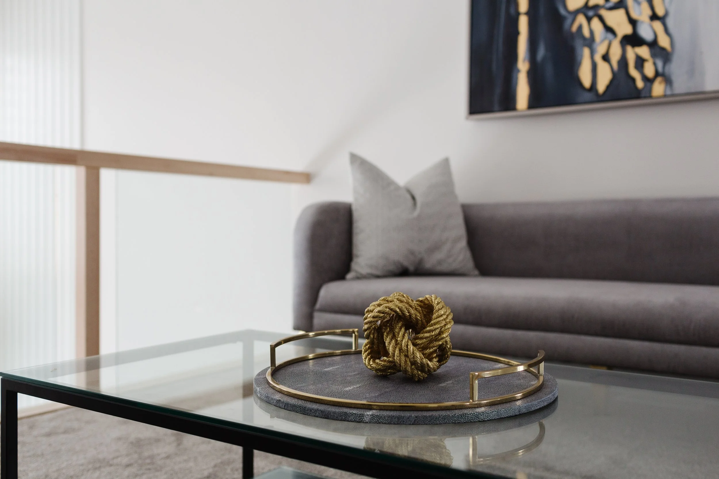
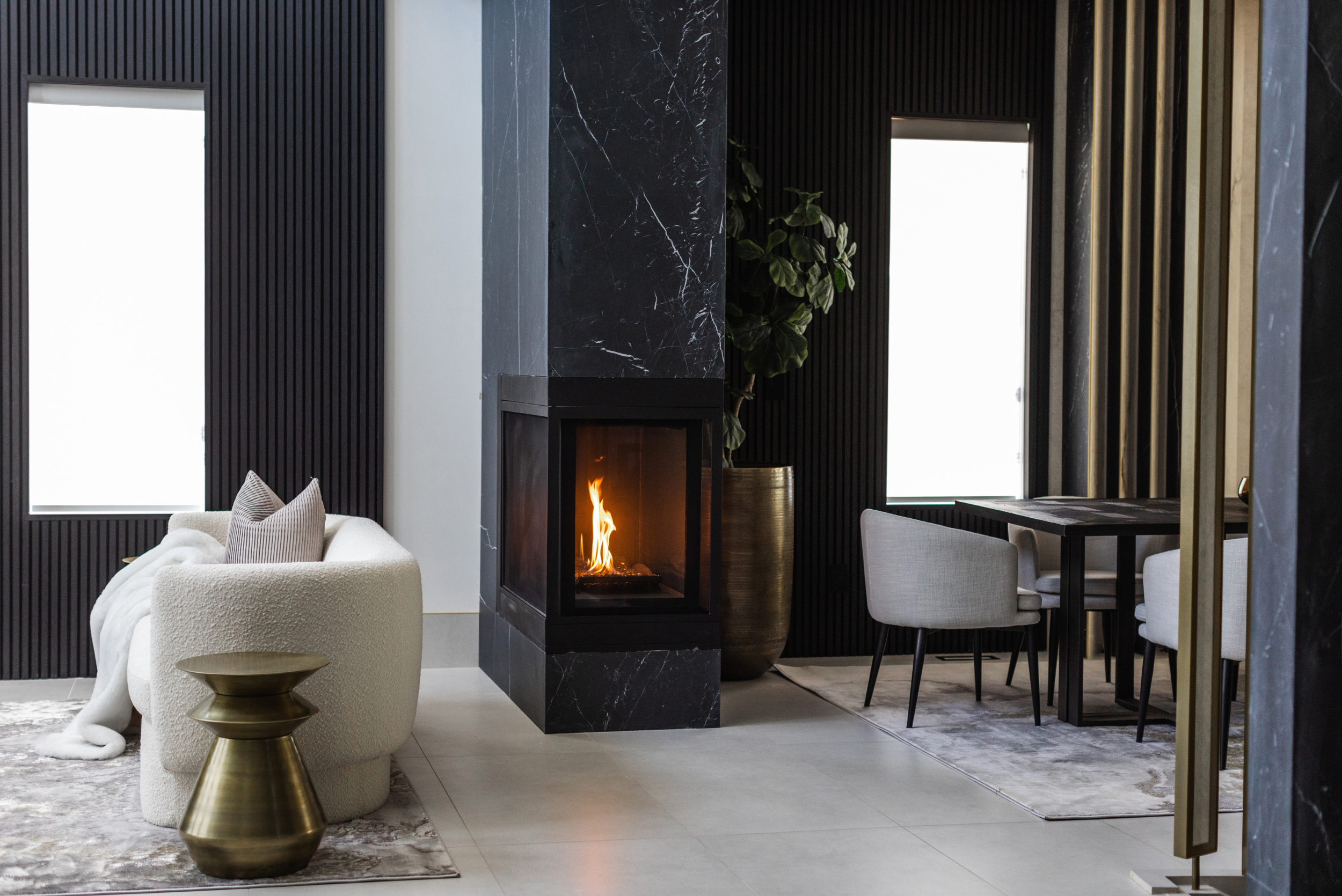
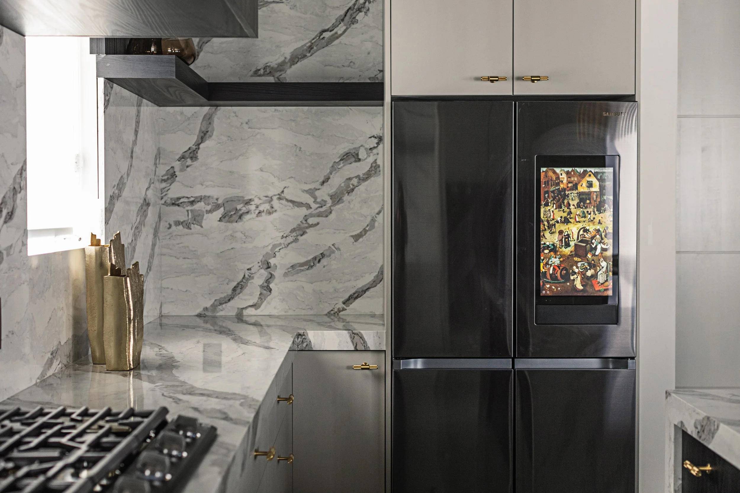
Modern spaces also benefit from simple colour combinations with grey colour choices like white oak, matte black, brushed brass, or soft neutrals. These combinations help the dark grey feel polished rather than overpowering.
Using Dark Grey Without Making it Feel Heavy
Many homeowners worry that dark grey will make a room feel smaller or colder. The key is balance. Choosing the right shades of grey paint colours matters just as much as where you apply them. Not all greys behave the same way on the wall.
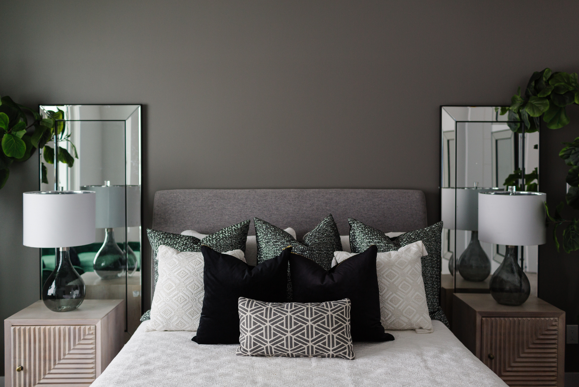
Warm grey colours contain subtle beige or brown undertones, making them feel softer and more welcoming. These are ideal for living rooms, bedrooms, and open-concept spaces. Cooler greys work well in kitchens, bathrooms, or spaces with strong natural light.
If you are unsure, start with accent wall colours instead of painting every wall dark. One grey wall can anchor a room while lighter tones keep it open and breathable.
Understanding Grey Before You Commit
Before choosing paint, it helps to understand a common question: is grey a colour or a shade? Technically, grey is considered a shade because it is created by mixing black and white. In design, this is why two greys that look similar in-store can feel completely different in you; however, grey behaves like a colour because of its undertones and emotional impact.
Lighting, surrounding finishes, and room orientation all affect how grey appears once applied. Testing samples in different areas of the room and observing them throughout the day is essential when selecting grey paint colours.
Choosing the Right Grey Paint for Walls
When selecting grey paint for walls, think beyond aesthetics and consider function. High traffic areas benefit from mid-tone greys that hide wear, while darker tones work well in feature spaces where mood matters more than maintenance.
Grey scale colours allow you to layer tones across a home without visual chaos. For example, darker greys can define social areas, while lighter greys support calm, private rooms. This approach creates flow without repetition.
What Colours Go with Grey for a Balanced Look?
One of grey’s biggest strengths is versatility. If you want to create a soft, elegant look, pair grey with muted neutrals like cream, taupe, or warm white. For contrast, black adds structure while still keeping the palette refined.
Earth tones like clay, olive, or tan add warmth and prevent grey from feeling flat. For a bolder approach, jewel tones like navy or emerald work well against dark grey backgrounds, especially when used in textiles or artwork.
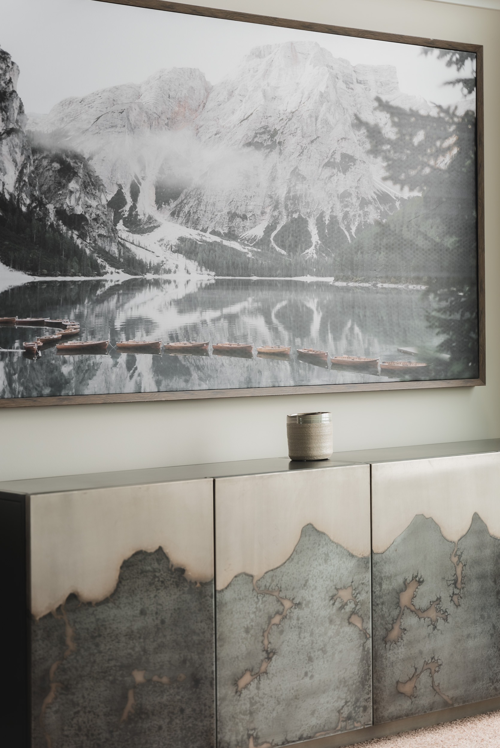
Using Accent Wall Colours Strategically
Accent wall colours work best when they serve a purpose. Dark grey accent walls are effective behind beds, sofas, or fireplaces because they add visual weight where needed. Avoid placing dark accent walls in narrow hallways or low-light areas unless balanced with mirrors or lighter finishes.
The goal is emphasis, not enclosure. Grey paint colours shine most when they support the layout rather than fight it.
Making Grey Feel Intentional, Not Trend Driven
The difference between a timeless interior and a dated one is restraint. Using too many shades of grey paint colours in one space can feel busy instead of cohesive. Stick to two or three tones and repeat them intentionally.
Layering textures such as wood, fabric, metal, and stone helps keep grey interiors from feeling cold. This is especially important when working with darker tones. When used thoughtfully, grey is not just stylish. It is adaptable, sophisticated, and built to last beyond trends.
Final Thoughts on Designing with Grey
Grey remains popular because it works. From subtle backdrops to dramatic feature walls, it adapts to personal style while maintaining elegance. When you understand undertones, lighting, and colour combination with grey colour options, you gain control over how your space feels.
Darker shades of grey is not about playing it safe. It is about making confident choices that support both function and design. Working with our experienced Edmonton interior designers can bring clarity to complex decisions such as layout, lighting, material selection, and colour balance.
Rather than relying on guesswork, a professional interior designer evaluates how a space functions day to day and ensures each choice supports both usability and long-term value. This level of planning helps avoid costly revisions and results in interiors that feel cohesive, intentional, and well considered from the outset.